 dcstephenson
4222da4a9b
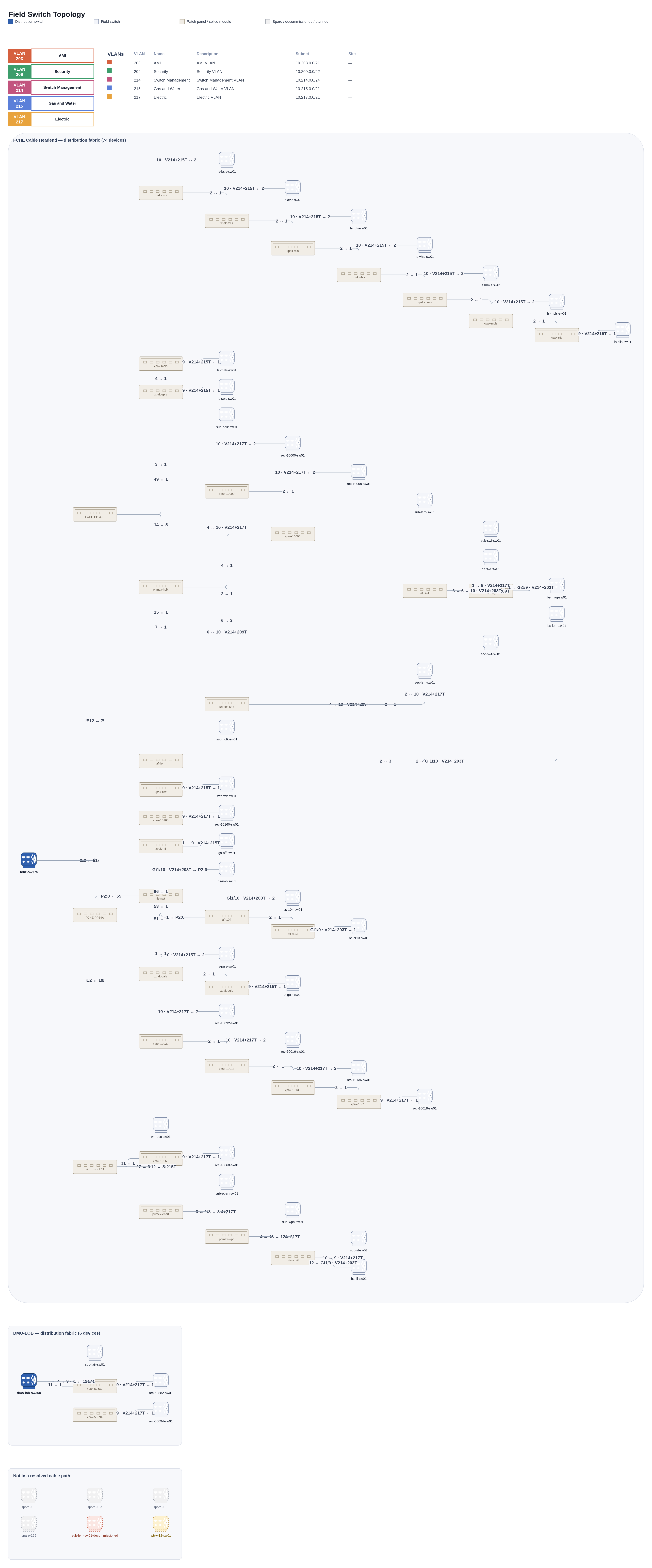
Dark navy body + high-contrast port ticks made patch panels the single
boldest thing on the page -- more visually dominant than even the
distribution switches, backwards for the least important device type in
the diagram. Switched to a pale warm-stone fill/stroke (distinct hue from
the switches' cool blue-grays, so it doesn't just read as 'a paler gray
box' next to the field-switch/spare swatches), a hairline seam instead of
a solid strip, and outline-only port ticks instead of filled dark ones.

Co-Authored-By: Claude Sonnet 5 <noreply@anthropic.com>
Claude-Session: https://claude.ai/code/session_01NM3nivbufxEWiKKmatEtEe
1.8 MiB
3952x9500px
1.8 MiB
3952x9500px